WLUC TV6 Gets a Facelift: What do you think of the new logo?
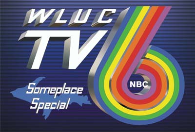
Across the Upper Peninsula TV6 is a staple. It is the go-to source for news in the Upper Peninsula, from Ironwood to Sault Ste. Marie and from Copper Harbor to Menominee. Their logo (their old logo now, that is) is arguably the most recognizable logo in the Upper Peninsula among local businesses.
However, TV6 is no longer “Someplace special”. They have moved on from their old logo and slogan. Here is an excerpt from their own news story on their website…
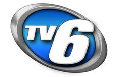
TV6 has a whole new look. It’s all part of our dedication to take you into the future of television and the Web. Our new logo and our color scheme is fresh and futuristic.
We’re well into the 21st century now, and we thought it was time for a change.
Personally, I have a few bones to pick with the new logo. Hey this a blog, it’s supposed to be opinionated.
Branding is a difficult task for businesses to achieve. What’s even more difficult than that is rebranding. From the outside it seems that the “Someplace special” slogan and rainbow TV6 logo has worked well over the years. For well over a decade (can anyone verify how long they’ve had this combination?) they have branded themselves to the 300,000+ citizens of the Upper Peninsula. They created a very recognizable logo and slogan that Yoopers all became familiar with. Rebranding in a sense is like starting over.
Growing up I always remember noticing the TV6 news cars on the highway somewhere. All I had to see was that rainbow logo. But now if people see a news car without that TV6 logo it’s very likely they’ll ask themselves, “What news station is that?”. Though it clearly still says TV6, it loses that recognizability that I have known my entire life. (For those of you visiting the site who are not familiar with the Upper Peninsula, TV6 is essentially the only news station in the entire Upper Peninsula.)
In terms of the new logo, it looks good. It’s professional, clean, and modern. My gripe, however, is that they carried nothing over from the classic logo that we have all come to know so well. The largest brands in the world update their logos from time to time, AT&T, Pepsi, Microsoft… but it’s a very rare thing for them to completely change their logo. Though I admit their old logo was a bit outdated, I wish they had somehow incorporated a part of the classic rainbow color scheme.
Take a look at their logos, vote on the poll below, and let us know what you think in the comments section.
Old TV6 Logo:
New TV6 Logo:
To go along with their new logo they have created a new slogan as well to replace “Someplace Special”. Their new slogan is “Upper Michigan’s Source”.
According to the TV6 website they are seeking opinions from readers and viewers…
We’ve also adapted our new slogan out of that dedication. We’ll be Upper Michigan’s Source for news, weather, and sports from around the world, 24 hours a day.
Not only that, but we want to hear from you…your opinions, your letters, your pictures, your video. wluctv6.com will be a true partnership between you and TV6.
…But our look has changed, and since you’re seeing this for the first time, we’d like to get your reaction. Be sure to vote in our Web poll on the homepage, asking if you like the new look.
While I appreciate their efforts, it seems as though they would have asked for viewers suggestions before changing their logo. And perhaps they did and we missed it. But, after the fact seems to be a little late.
Please let us know your opinion. And if you would like to share more of your thoughts please comment below, we would love to hear it.
And also, what do you think of the new TV6 slogan, “Upper Michigan’s Source”?


