Ugliest Michigan Map Ever!
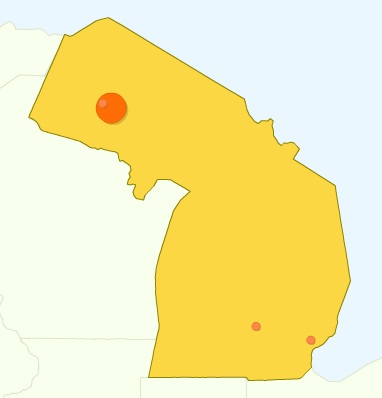
Last November I stumbled across a map on Google images. It took but a second of thought to notice that it was the ugliest rendering of Michigan that I had ever seen on a map. The Lower Peninsula was pretty horrible, but the rendering of the Upper Peninsula was even worse! For anyone who holds the U.P. close and dear to their heart, you may have to sit down before looking at this.


It didn’t take long for my friend John to note that this map was taken from the Google Analytics program. As sad as it is to see this map of Michigan and the U.P., there is some legitimacy to it. Recently I came across this Michigan map outlining the border of the state, not just the land. Sure enough, it’s the exact same shape.
I came across this map long before I thought of creating Yooper Steez, but it became inspiration. I thought back to all the times I saw that the Upper Peninsula was missing from a United States map, or was terribly drawn. It was time to set people straight, and show them what the U.P. really is.
What ugly maps have you seen of the U.P.? Or how often do you see a map of the United States without the Upper Peninsula?


